

Are you thinking of rebranding your company? Needing to rebrand is not a bad sign! Most successful companies do it and often, a rebrand means that the company has evolved beyond its previous identity and is ready to reach new heights! Berning Marketing has helped many companies reach their fullest potential through rebranding processes. In order to be the best in the business, sometimes, you have to look at the worst in the business. Since it’s Halloween day, feast your eyes on the horrors of rebranding fails.

Sure, the old logo for Seattle’s Best Coffee does look like it stepped straight out of the 70s, but the idea to simply the logo was a failure. When people see red and a drop, they usually think blood. This symbol has been used from everything from blood drives to feminine hygiene products.

This is something that happens a lot more than you would think. With Dr. Pepper looking at their market and realizing that men do not drink their diet drinks, they came up with Dr. Pepper Ten. The campaigns for Dr. Pepper 10 started by declaring the soda was not for women and their website featured a flash game where you could shoot at things that symbolized femininity. Dr. Pepper seemed to get the feeling that masculinity around the world was being threatened by diet dr. pepper, and they tried to fix it. However, it was received as another horrific display of over-the-top rebranding that fell flat on it’s face.
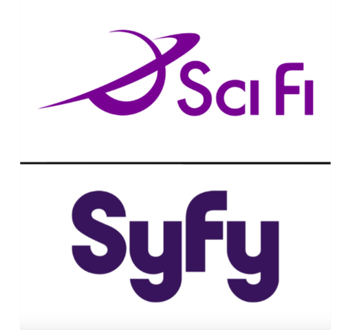
The Sci Fi network renamed themselves with what they hoped to be just a simpler and cooler misspelling. Unfortunately, SyFy is a slang term for the STI syphilis. There’s a good lesson to be learned here and that is to always google and check everything before you launch a major rebranding.

With the catchphrase “It’s all about the O” defined as their slogan, Overstock spent millions to become O.co. This idea completely flopped due to the very short URL. The lesson you can learn from this mistake is that audiences prefer words for URL’s.
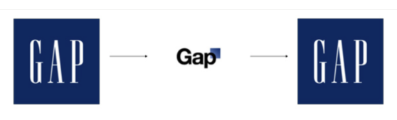
Gap has used the same logo for a really long time. It’s very understandable that they would try to rebrand and try a different logo. After spending way too much money on a simpler logo, they resorted in going right back to the old one.
Don’t make a huge mistake with your rebranding strategy, let us help! We have a team of graphic designers that will take care of it all and a creative director that will make sure that your new logo speaks volumes!